Argentina just won the 2022 FIFA World Cup. While I was checking Twitter (which will probably be dead soon) today, I saw this post.
— Terrible Maps (@TerribleMaps) December 19, 2022
Since I have no motivation to do work today, I might as well attempt to recreate this awful data viz.
As stated in the description, this is just for fun.
In fact, don’t plot any nonsense like this for your project/research.
(Although… this may be a useful tutorial for plotting maps in R.)
library(tidyverse)
theme_set(theme_minimal())
# theme for later
theme_map <- theme(
  plot.title = element_text(
    face = "bold",
    hjust = 0.5,
    size = 18
  ),
  legend.position = "none",
  axis.title = element_blank(),
  axis.text = element_blank(),
  axis.ticks = element_blank()
)
First, data for plotting a world map can be obtained from the function map_data of the ggplot2 package.
Here’s a glimpse of our data.
Rows: 99,338
Columns: 6
$ long      <dbl> -69.89912, -69.89571, -69.94219, -70.00415, -70.06…
$ lat       <dbl> 12.45200, 12.42300, 12.43853, 12.50049, 12.54697, …
$ group     <dbl> 1, 1, 1, 1, 1, 1, 1, 1, 1, 1, 2, 2, 2, 2, 2, 2, 2,…
$ order     <int> 1, 2, 3, 4, 5, 6, 7, 8, 9, 10, 12, 13, 14, 15, 16,…
$ region    <chr> "Aruba", "Aruba", "Aruba", "Aruba", "Aruba", "Arub…
$ subregion <chr> NA, NA, NA, NA, NA, NA, NA, NA, NA, NA, NA, NA, NA…
As for data wrangling, the only task is to create an indicator column for whether or not a country is Argentina.
Then, the key for making the map is to use geom_polygon(), with a specified group aesthetic for drawing the countries.
The so-called “base map” looks like this.
base <- map_data("world") |>
  mutate(arg = ifelse(region == "Argentina", "y", "n")) |>
  ggplot(aes(long, lat, group = group, fill = arg)) +
  geom_polygon() +
  scale_x_continuous(breaks = seq(-180, 180, 40)) +
  scale_y_continuous(breaks = seq(-90, 90, 30))
base
The next step is to transform the map from the current Cartesian coordinate to a new map projection.
The function coord_map() can be used to accomplish this.
After some digging, I find that orthographic projection is the right representation here.
(For more information about the different types of projection available, run ?coord_map and ?mapproject).
I also use an online color picker to get the right colors for filling the countries.
ar <- base +
  scale_fill_manual(values = c("#e0e0e0", "#176b2d")) +
  coord_map("orthographic", orientation = c(-30, -60, 0)) +
  labs(title = "Argentina") +
  theme_map
ar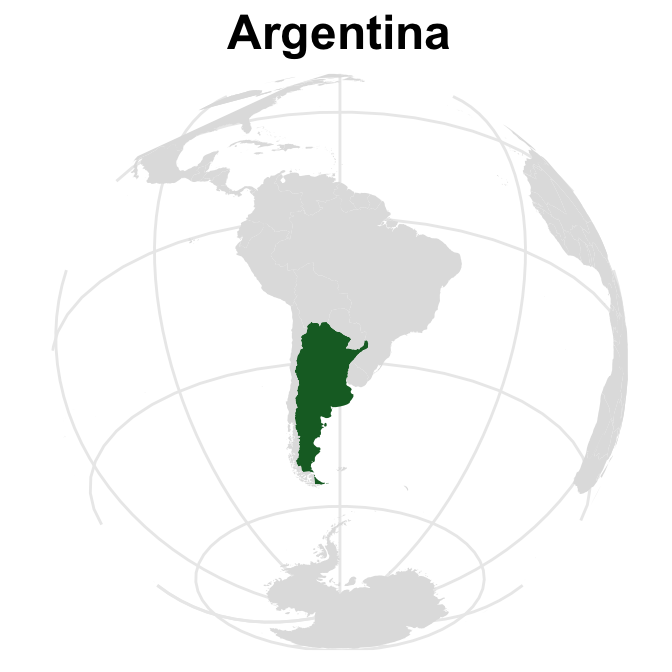
Now, let’s quickly play the same game and make the second plot.
arent <- base +
  scale_fill_manual(values = c("#176b2d", "#e0e0e0")) +
  coord_map("orthographic", orientation = c(-15, -60, 0)) +
  labs(title = "Are'ntgentina") +
  theme_map
arent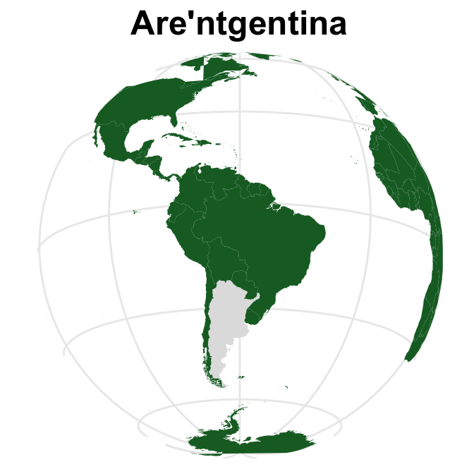
Finally, the two plots can be patched together to get the desired figure.
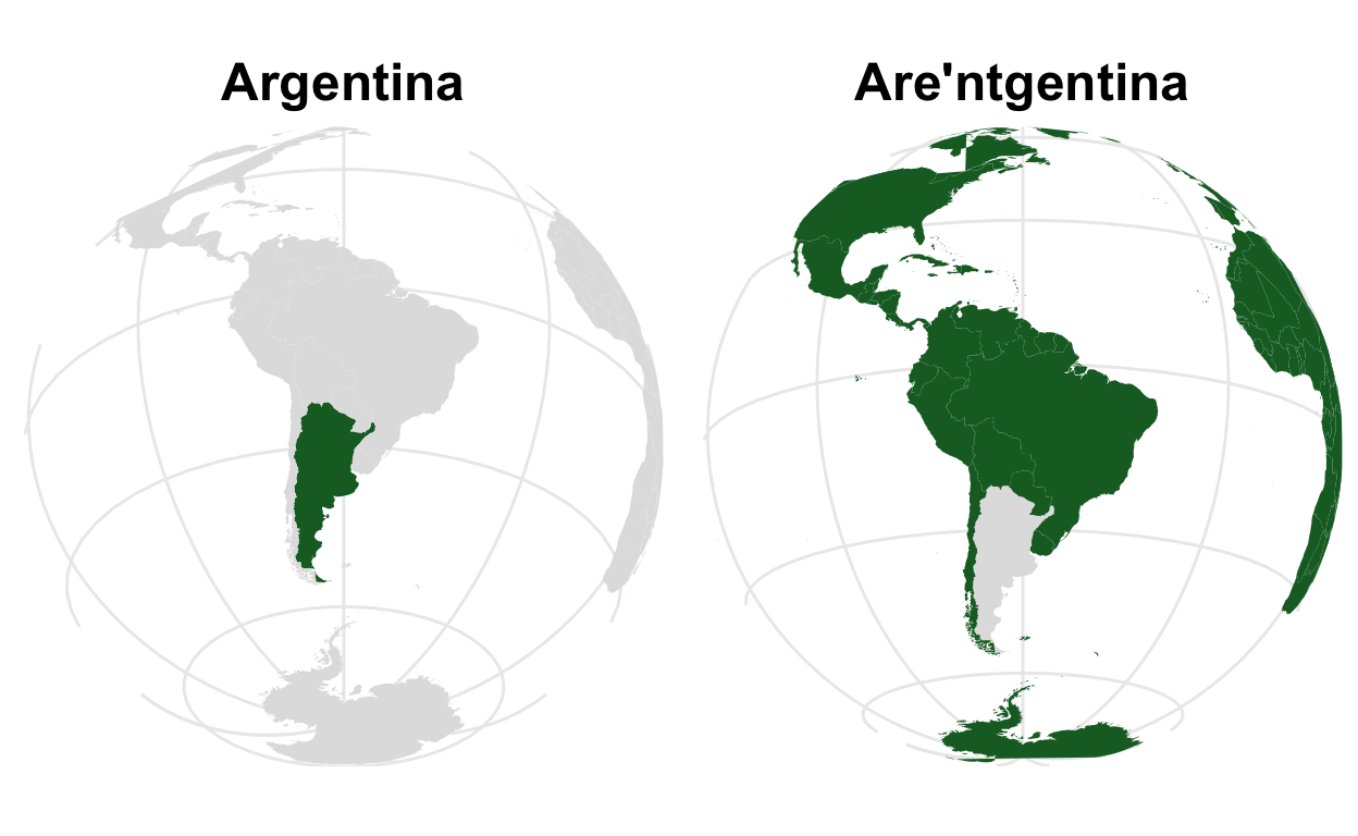
Looks great to me. More work can be done regarding finding the correct rotation/projection angle, but this is good enough for now.
By the way, after finishing this map, I found out that coord_map() is superseded by coord_sf().
I quickly looked into this function (and its relatives), and it appears that the syntax is a bit more complicated and somewhat dependent on the powerful sf package.
I will certainly try this out at another time.